Wednesday, December 5, 2012

Art Contest- Upcoming Project

I received an email about an art contest from the Space Foundation and I think it would be a fun project for the art students to enter.

The prizes are not SUPER but getting the award could be a good thing for your college applications if you were to win.  Plus I think the theme of the project is kind of fun AND it would be a good way to decorate the school just in time for Science fair in Feb.

I am going to have this be project and you will be able to work on it in class, so that means I am going to push off the assignment dealing with your college art concentration to the next project. BUT your blog entry is still due next week on Monday.

In the meantime I would like you to start doing some brainstorming and some sketches for your next sketchbook assignment due Wens next week.

For the contest the work can be either
Drawing
Painting/Mixed Media
or
Digital (i.e. photography, or using your own drawings or paintings or collage and then manipulating it in photoshop)


I would like you to BE CREATIVE with this.  Think about the theme "If I were going"...... as in going to take a trip to outer space.  There is a lot of potential ways to go about it and I think the Surrealism project would be a good foundation for you since you really are going to have to think OUT OF THIS WORLD.

Some potential ideas:
Outer space fashion- what would you were on the ultimate vacation?
Space travel brochure- advertising travel to space
Outer Space hotel/resort- what would it have?
How would you breathe?- designing a stylish and functional oxygen mask
Pop Space Art- think out of this world Andy Warhol
Design your space ship
Alien space ships you might see
Flag design for our galaxy
Aliens you might meet- what could they look like- BE CREATIVE if you do this one, in other words, no Yoda or Chewbacca......


Artists who can inspire you:  GOOGLE them and see how their ideas could influence yours-
Alex Grey
Pearl C. Hsiung
Jeremy Geddes
Peter Max + space
Roger Dean + outerspace
Or just have fun with google images;  artists outerspace   ,    modern art outerspace,   
http://we-make-money-not-art.com/archives/2008/04/chinese-contemporary-art-beyon.php#.UL-8j4OsiSo


I want them to be the largest size they are allowing- 18 x 24 inch

Here is the information about the contest rules PLEASE READ and if you want look at the entries from past contests -

http://www.artsonia.com/museum/collections/detail.asp?coll=265

Monday, December 3, 2012

Blog assignment- What do you want to do?

Blog due Dec. 10
Write about what it is you are thinking that you would like to study in college for art or design.
Paragraph 1 Why are you thinking about this concentration?
Paragraph 2 What do you want to do with this major?
Paragraph 3 What projects do you think you can do next semester to show that you are interested and able to work in this area of art or design?

Tuesday, October 30, 2012

seeking inspiration

For next week- Wens. P
Research artists from this site

http://www.huffingtonpost.com/arts/

It can be from any of the topics listed.

then on your blog post a link and write some about why you chose this artist/link.

DUE Wens Nov 7th

Tuesday, October 23, 2012

Assignment planning

Start looking for materials for a collage.  Any materials you can bring in and would want to use
Magazines
Photos
Papers
Cardboards
Advertisements
textured materials
string
fabrics

Start bringing things in asap.  We will need it next week.

Sunday, October 14, 2012

sketchbook due Oct 24

Draw at LEAST 5 objects that you think of as visually interesting, mysterious, or remind you of something that is strange.  You can use google images to come up with your ideas.   Due Wens Oct 24

Friday, October 5, 2012

Issue project 1

Watch this video
http://www.youtube.com/watch?v=8ap2xnMcvpw&feature=related

then make a post on your blog about it giving your impression of the video and your thoughts on the issue.

Due Oct 17


Tuesday, October 2, 2012

Due Oct 15


Do 3 landscape drawings.  Look at actual landscapes- not photos.  Use color pencils.
Can be any aspect of landscape and in any style.
FULL page drawings.  You have almost 2 weeks for this assignment.

ALSO study the color theory information for a test Oct 15.
http://pasvisualart.blogspot.tw/2012/10/color-theory.html

DO NOT PROCRASTINATE!

Sunday, September 30, 2012

Parsons in Taipei Sunday


Parsons The New School for Design from New York will meet students interested in pursuing degrees at Parsons.
Information Session: Taipei
Date: Sunday, October 7, 2012
Location: Hotel Éclat, Taipei
No. 370, Section 1,
Dunhua South Road, Da-an District,
Taipei City 106
Taiwan
Time: 3:00 PM - 5:00 PM

If you are able to go please come see me this week to sign up. 

Tuesday, September 25, 2012

Due Oct 3

Go to
http://www.googleartproject.com/

Explore the site and choose works and artists that you most like.
On your blog write your top choices listing the artist's names and the titles of the work you like.
You should have at least 5 artists listed.
Go to google images search and on your blog also add the images of the work you chose

THEN write about them and discuss what you like about the work you chose.

DUE Oct 3

NOTE- for Monday Oct 1 BRING YOUR SKETCHBOOK, PENCIL SET, and COLORED PENCILS as well as an eraser.

Wednesday, September 19, 2012

IMPORTANT!!!!!! Supply list requirements


Because of the large number of art students we currently have and because many are in our various courses offered we need to now have students purchase required supplies for each class.   

Note that you do not buy books for this class- your supplies are your tools.  If you have trouble finding something let me know. 


Each student needs to get these materials asap if you do not have them already BUT you need to have them in class to be able to use them. If you dont have them then you cant work and if you are not working you will get deductions for participation/studio habits grades each time you do not have them.  So this is really important.  


NOTE that in honors studio art you will be doing both 2D and 3D work.  
3D will be later in Feb and March

SUPPLY LIST 

Of course EACH CLASS NEEDS A SKETCH BOOK (a 9inch by 12 inch size preferably)

NOTE Some items below are also for 3D but absolutely for 2D.  Those for 3D are noted. 

Items you need to buy immediately and have ready to use in every class:


MOST IMPORTANT!!!
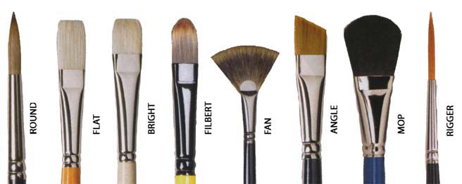
-set of brushes   (FOR 2D and 3D classes)
You should have a variety of sizes  and types.  Here are the names of brushes.  Realize that better quality brushes will work better, but will cost more money. 
Also realize that you should some brushes you only use for watercolor- ask at the art store

You might not need a MOP or RIGGER but they can be helpful.  A MOP would be for watercolor


-Brush holder to safely carry your brushes.  You need to take care of them and make sure they are cleaned as well as do not get bent .  (FOR 2D and 3D classes)


-set of watercolors and paint tray.  Again you pay for what you get.  The better paint will cost more and the more colors you have the more you have to work with.  
Get a good brand like Windsor Newton.   They can be tubes or a palettes
Also you might want to get a set of Gouache paint as well


-Some of you have them already but you need to be sure you have FULL pencil sets   (FOR 2D and 3D classes)

-Kneadable erasers, a magic rub, and a regular eraser   (FOR 2D and 3D classes)


-variety of sizes of sharpie markers in black   (FOR 2D and for 3D)
You can also get other color sharpies if you wish but you should get the ultra fine points and the fine point or the twin point in black


You should get a good set of markers 
Yes sharpies are expensive but they are the best, next is prismacolors, or derwent.  
NOTE--Cheap ones dry up quick so you just wast money in the long run.  Taking care of good quality markers properly you can have them a long time.


 - portfolio to carry your work back and forth from home to school.  DO NOT ROLL UP OR FOLD YOU WORK ANYMORE.  
You can get a card stock portfolio or a better quality one. 
 It should be for work in progress, not one that has your old work stored in it and it needs to be at least 20 inch by 25 inch or larger.
Google search Art carrying case portfolio


-Compressed charcoal-  a box and maybe two of different hardness

-Rubber Cement


 -A set of colored pencils.  If you get the better brands like PRIMSACOLOR or DERWENT or Faber Castel you will see the difference in your quality outcome and if you get a larger set than you have more options to work with.  And like the markers and watercolors, the more colors you get the more tools you have to work with.


Masonite light weight artist's board (ideally a 45 inch wide board-  but no smaller then 25 inch wide)  and it doesnt need to have the clip on it
Lastly but not least- Artist's QUALITY PAPER
You know that the paper we have in class is not that good for doing drawing and it is dreadful for watercolor but its is worse for charcoal and pastel since it does not have texture or a "tooth" as its called. 

I suggest you get a few large sheets each of these to during the year- get a few of each to start and you can cut them down to the sizes you need. 
NOTE THESE ARE FOR PROJECTS NOT FOR SKETCHING- use your sketchbook for that.

Arches 140 hot press paper 


Strathmore® drawing Paper is available in 300 Series drawing paper, 
400 Series drawing paper and 500 Series drawing paper for varying levels of ability. 
Students and beginners start with 300 Series drawing paper, then move to the 400 Series drawing paper for more stringent performance measures. 500 Series is our professional grade drawing paper made with 100% cotton fibre. This drawing paper has the toughest surface taking repeated erasures and reworking.  This drawing paper is acid free but it is not archival, meaning that there is some wood pulp in it that will cause the paper to yellow over time. Arches paper is 100% rag, and he says that is the best to use for your masterpieces


Strathmore Charcoal Papers
 in our 300, 400 and 500 Series charcoal papers is manufactured with a traditional laid finish making them the ideal foundation for this medium. The laid texture provides a great toothy surface for building layers of pastel colour.

Strathmore Pastel Paper comes in many textures and shades to create the ideal background for pastel paintings. Our 400 Series pastel paper contains sheets ranging from subtle tints to deep fibre-enhanced colours. The 500 Series allows the artist to choose from a full range of 28 colours. The surfaces of these pastel papers are great for soft or hard pastels, oil pastels and charcoal.


OPTIONAL SUGGESTED ITEMS------------------------------------------------------------------------------------------------- 

-spray paints in the colors you want to use   
 (FOR 2D and 3D classes)

-artist's tape to adhere paper to the masonite boards

- Reed pen or other pen quill for pen and ink drawing

-watercolor colored pencils set

-A top quality artist's watercolor brush -#6 sable or red sable brush. Note-- a red sable is an investment and if you take care of it you can have it for the rest of your life)


and I strongly suggest you get an art bin or box or bag to carry these supplies with you (btw all art students always have to carry their materials to classes so get used to it now)

-----Specifically for 3D classes
Elmers wood glue
Metal glue (scotch brand tubes)
ceramic glue (scotch brand tubes)
glue gun with glue sticks
masking tape
plastic tape
wire of various gauges (sold in rolls or in packages)
Assorted 9x11-5/Pk Sandpaper
Cellfoam 5mm thick- a few sheets
Cellfoam10mm - a few sheets
Spray paint in the colors you might want to use
And of course you should be looking around for materials you can use from everyday life- 
recyclables of all kinds.


Monday, September 17, 2012

Due sept 26

Perspective
One point perspective shown here http://studiochalkboard.evansville.edu/lp-seeingA.html

Two point perspective shown here http://studiochalkboard.evansville.edu/lp-in2A.html


Do a drawing of each type of perspective.  Can be interior or exterior
Due next Wens Sept 26

Saturday, September 8, 2012

Reading Assignment

Read this article from the New York Times-
http://www.nytimes.com/2012/09/02/opinion/sunday/architecture-and-the-lost-art-of-drawing.html?_r=1&pagewanted=all

(also listed below)


Then on YOUR blog write about it
1. Describe the main ideas
2. Interpret the meaning as to how it can apply to you and your work
3. Evaluate what your opinion is about the opinion of the article

DUE NEXT WEEK Mon SEPT 17
-------------------------------------------------------------------------------------------------------------------


Architecture and the Lost Art of Drawing


IT has become fashionable in many architectural circles to declare the death of drawing. What has happened to our profession, and our art, to cause the supposed end of our most powerful means of conceptualizing and representing architecture?
The computer, of course. With its tremendous ability to organize and present data, the computer is transforming every aspect of how architects work, from sketching their first impressions of an idea to creating complex construction documents for contractors. For centuries, the noun “digit” (from the Latin “digitus”) has been defined as “finger,” but now its adjectival form, “digital,” relates to data. Are our hands becoming obsolete as creative tools? Are they being replaced by machines? And where does that leave the architectural creative process?
Today architects typically use computer-aided design software with names like AutoCAD and Revit, a tool for “building information modeling.” Buildings are no longer just designed visually and spatially; they are “computed” via interconnected databases.
I’ve been practicing architecture since 1964, and my office is not immune. Like most architects, we routinely use these and other software programs, especially for construction documents, but also for developing designs and making presentations. There’s nothing inherently problematic about that, as long as it’s not just that.
Architecture cannot divorce itself from drawing, no matter how impressive the technology gets. Drawings are not just end products: they are part of the thought process of architectural design. Drawings express the interaction of our minds, eyes and hands. This last statement is absolutely crucial to the difference between those who draw to conceptualize architecture and those who use the computer.
Of course, in some sense drawing can’t be dead: there is a vast market for the original work of respected architects. I have had several one-man shows in galleries and museums in New York and elsewhere, and my drawings can be found in the collections of the Metropolitan Museum of Art, the Museum of Modern Art and the Cooper-Hewitt.
But can the value of drawings be simply that of a collector’s artifact or a pretty picture? No. I have a real purpose in making each drawing, either to remember something or to study something. Each one is part of a process and not an end in itself. I’m personally fascinated not just by what architects choose to draw but also by what they choose not to draw.
For decades I have argued that architectural drawing can be divided into three types, which I call the “referential sketch,” the “preparatory study” and the “definitive drawing.” The definitive drawing, the final and most developed of the three, is almost universally produced on the computer nowadays, and that is appropriate. But what about the other two? What is their value in the creative process? What can they teach us?
The referential sketch serves as a visual diary, a record of an architect’s discovery. It can be as simple as a shorthand notation of a design concept or can describe details of a larger composition. It might not even be a drawing that relates to a building or any time in history. It’s not likely to represent “reality,” but rather to capture an idea.
These sketches are thus inherently fragmentary and selective. When I draw something, I remember it. The drawing is a reminder of the idea that caused me to record it in the first place. That visceral connection, that thought process, cannot be replicated by a computer.
The second type of drawing, the preparatory study, is typically part of a progression of drawings that elaborate a design. Like the referential sketch, it may not reflect a linear process. (I find computer-aided design much more linear.) I personally like to draw on translucent yellow tracing paper, which allows me to layer one drawing on top of another, building on what I’ve drawn before and, again, creating a personal, emotional connection with the work.
With both of these types of drawings, there is a certain joy in their creation, which comes from the interaction between the mind and the hand. Our physical and mental interactions with drawings are formative acts. In a handmade drawing, whether on an electronic tablet or on paper, there are intonations, traces of intentions and speculation. This is not unlike the way a musician might intone a note or how a riff in jazz would be understood subliminally and put a smile on your face.
I find this quite different from today’s “parametric design,” which allows the computer to generate form from a set of instructions, sometimes resulting in so-called blob architecture. The designs are complex and interesting in their own way, but they lack the emotional content of a design derived from hand.
Years ago I was sitting in a rather boring faculty meeting at Princeton. To pass the time, I pulled out my pad to start drawing a plan, probably of some building I was designing. An equally bored colleague was watching me, amused. I came to a point of indecision and passed the pad to him. He added a few lines and passed it back.
The game was on. Back and forth we went, drawing five lines each, then four and so on.
While we didn’t speak, we were engaged in a dialogue over this plan and we understood each other perfectly. I suppose that you could have a debate like that with words, but it would have been entirely different. Our game was not about winners or losers, but about a shared language. We had a genuine love for making this drawing. There was an insistence, by the act of drawing, that the composition would stay open, that the speculation would stay “wet” in the sense of a painting. Our plan was without scale and we could as easily have been drawing a domestic building as a portion of a city. It was the act of drawing that allowed us to speculate.
As I work with my computer-savvy students and staff today, I notice that something is lost when they draw only on the computer. It is analogous to hearing the words of a novel read aloud, when reading them on paper allows us to daydream a little, to make associations beyond the literal sentences on the page. Similarly, drawing by hand stimulates the imagination and allows us to speculate about ideas, a good sign that we’re truly alive.
Michael Graves is an architect and an emeritus professor at Princeton.
Sunday, September 2, 2012

sketchbook due Monday 9-10

In your sketchbook you are to do at least 3 full page drawings.
You are to create 3 very different MOTIFS  (not sure what a motif is, look it up)
These should be done with pencil, then go over them with black or blue pen when you have settled on your motif design.

FOR FUTURE NOTICE of sketchbooks
When I say its free sketch week, this is the kind of thing I am asking for to give you some idea:
http://www.rc-artkids.com/Class/sitedocuments/AP/GetCreative.pdf


Thursday, August 23, 2012

For art's sake

In paragraph form write responses to these questions in the comment section
Why are you wanting to study art?
What is it you like to do?
What experience do you have with art?
What do you want to learn?
What do you see yourself doing in art for college?
due Monday 4th period

Thursday, August 16, 2012

Honors intro class

We are going to treat this class as a PRE AP with the intention to do works that could fit in the BREADTH section of an AP portfolio.  We are going to use the 1st sem for 2D work and 2nd for 3D work.

You should start investigating what the AP Breadth section means.  Look online and then also search for AP portfolios to look at examples of others work BUT PLEASE DO NOT PLAGIARIZE from others work and ideas.  Look at others work to get an understanding of the BREADTH section.

ESPECIALLY if you plan to take an AP you should check out this site-
http://www.collegeboard.com/student/testing/ap/sub_studioart.html

ALSO you need to get a NEW sketchbook for this class.  You need to have it for SEPT 3rd.  It will be a pass or fail homework grade to have a sketchbook that day and in it you should have at least 3 drawings of anything you wish. Just work on something to get your mind into what you would want to work on.

Lastly, you will occasionally need your laptop in class so bring it with you as it can help you from time to time with different assignments or to get ideas or if I want you to look something up.

1st PRODUCTION PROJECT USING PRINCIPLES OF ART
Drawing using BALANCE
Symmetrical - Asymmetrical - Radial